It’s easy to look at the finished product of something and think that it was the result of careful, planned designs and processes. But, as anyone who has every designed something will tell you, the reality is far more chaotic. We don’t always think about where some design elements and features in our software come from, but in the case of these four examples the “genius” came from an accident.
Adjustable UI parameters
We take it for granted these days on our operating systems that we can change the look and feel of the interface. You can change the colors of windows, the system font, the appearance of specific elements such as buttons, and more. It varies from one OS to the next, but the principle is the same. If the user wants to change the way things look and work—let them. Even if it makes a UX “expert” cringe.
Credit: Audio und werbung/Shutterstock.com
Now, while I can’t say for sure that this one particular incident was the genesis of UI adjustment in modern computers, and why your mom uses that awful font on her phone, a certain Steve Job-inspired development could very well have been the beginning.
As recounted in Andy Hertzfeld’s Folklore article, and early Apple employee named Chris Espinosa was working on the design for a Mac calculator app. But, when he showed it to Steve Jobs, there was a long list of criticisms about how it looked.
Jobs was famously nitpicky, and in the end Espinosa had the stroke of genius to simply add a bunch of sliders and settings that would let his persnickety boss sit down and just mess around with every aspect of the app’s interface until he was happy. Thereby (perhaps) accidentally creating the idea of letting the user decide what the UI should be.
Related
Windows 11 Locks Away These 4 Features, but They Should Be Standard
These should really be included in the base operating system.
Credit: Benj Edwards / How-To Geek
I’ve waxed lyrical about the excellent (and legendary) Microsoft Intellimouse in the past, which is partly famous for introducing the scroll wheel instead of a middle mouse button. Something which has proven invaluable in the internet age, and for anyone who has to deal with documents and spreadsheets.
The thing is, if you believe one of the people who claim to have invented the scroll wheel, it was never intended for scrolling. Instead, it was meant to be a zoom wheel, or so says Oculus co-founder Jack McCauley in an interview with IGN.
Whether McCauley is actually the sole or even major contributor to the idea of the wheel or not, I have to point out that we actually do use the scroll wheel for zooming in lots of applications. So the idea of it being a Z-axis controller still holds true in 3D apps and games, but it is a little funny to think that someone had these big ambitions for a new hardware feature, and then software developers used it to avoid having to drag a scrollbar around.
Related
Stop Using Your Chromebook Wrong: 7 Features You Probably Missed
I bet you didn’t know about #3!
Undo becoming a permanent feature after a debugging hack
Credit: Sarah121/Shutterstock.com
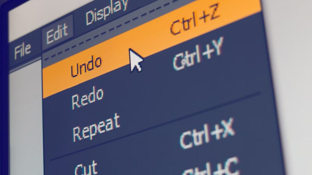
We all take it for granted that we can Ctrl+Z our way out of most mistakes. In fact, these days, with computer memory being abundant, you can often “undo” multiple steps of what you’ve done in most apps.
Now, a function that’s effectively an “undo” feature has been invented multiple times independently, but it started out as a way to debug software. So that you can step back through the software line by line in reverse until you figure out what went wrong. This was proposed in Marvin Zelkowitz’s 1971 PhD thesis Reversible Execution as a Diagnostic Tool.
Others expanded on the idea, but it was the programmers at Xerox PARC (where both Bill Gates and Steve Jobs were “inspired” to make graphical interfaces) who gave us the Ctrl+Z shorcut and “undo” nomenclature we know, love, and are often saved by today.
Related
Why I Prefer a Tiling Window Manager on Linux
They aren’t for everyone, but I can’t get enough of them.
Tabbed browsing evolving from a boring productivity feature
Credit: putrakurniawan78/Shutterstock.com
When I first started browsing the internet in the late 90s, there was no such thing as tabbed browsing, and I really struggle to remember how we survived without it. Actually, I could only really load one web page at a time on dialup, so maybe it wasn’t that much of an issue. Still, when I got my first browser with tabs, it completely changed the way I worked and used the web.
The thing is, there were already applications like word processors with tabbed interfaces as far back as 1982. I actually remember my dad using Borland Quattro Pro in the ’80s and ’90s with tabbed spreadsheets. The first browsers with this feature came out in the mid-90s, but like most people I only started using tabbed browsing in the early 2000s with Firefox. Somehow, it took Internet Explorer until 2007 before it also adopted tabbed browsing as an option. But then it was always slow to catch up.
The thing is, while tabs were not designed for web browsers, and it was initially only added as an option in some browsers, actual browser users quickly switched to tabbed browsing instead of heaving every website open in its own window. So while we think of them as synonymous with web browsing now, that’s not what they were meant for.
I typically have 20-40 tabs open split across three windows and two monitors at any time. I can only imagine how much less productive I would be if I had to juggle and manage 40 separate windows!

